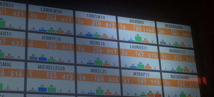
Check out this picture. Among the color bars and numbers, one thing to decipher is I burned over 1,000 calories at the gym today! But how I did it may surprise you.
As a recap of Orange Theory’s workout, you’re hooked up to a heart rate monitor which reads how much time to spend in each heart rate zone indicated by a color. Grey is you’re at rest, Blue is you’re walking around, Green is cardio – “challenging but doable” and should be your largest zone, Orange is “Push” level, and Red means slow down!
So while today’s workout had the largest caloric burn, you can see that my orange/red zones weren’t incredibly high at all, in fact, it’s right in the middle of where they suggest you should be. That’s because I changed my mindset a little bit and actually listened to what they said to do, haha.
Usually when we slow down our pace, especially after a sprint, I’ll go back to walking. Half because I’m usually exhausted by then, but also half because I’m in such poor shape it’s necessary because my heart rate wouldn’t recover back before it was time to increase the intensity again.
Now that I’m in a little better shape, I decided to keep the recovery phase an “active recovery” as the trainers say. Just go back to my base pace and not below.
Also, instead of focusing on increasing my fastest sprint speed like I have been, I decided to increase my slowest pace instead, and that kept my cardio going strong in a healthy and safe zone, and ended up giving me my largest burn to date.
On top of that, I feel great! So, something to learn is not to just focus on one number (in this case, top speed) but all the numbers involved. Increasing my “challenging but doable” pace benefited me much more than trying to increase my sprint speed.
So same principle can go for this health journey. Don’t focus on weight alone, focus on weight, performance, quality of sleep, overall energy, and just how this journey is making my life better in every area possible.
